How to Draw Grid on A4
For me, the main role of graphic design is to represent information to readers so that they can understand it without any bewilderment but with simplicity, being showed clearly, orderly, sequentially, and consistently. To achieve this, there is no better tool than grid system.
In this article I am going to show you how to draw a grid on A4 paper.
1. Know Your Material
In order to draw a proper grid for your project, it is very important to understand what you are designing. In this article, I will simply use title and body text as a representation.
2. Paper Size
In real world, the size of paper to be used might be given from your client. Or you must decide based on their purpose, budget, or the amount of materials you are dealing with. Nevertheless, this time I simply use the DIN A4 size just because it is used perhaps most frequently in Japan, or in the world.
3. Structure of Grid
After knowing your material and choosing the size of paper, you can decide the basic structure of grid. Since this time the material is so simple that it consists only title and body text, I decide to use 2x4 modular grid.

For the alternatives of the basic structure of modular grid, you may want to check out Construction of Basic Grids.
4. Typeface – Font Size and Leading
4-1. Typeface
Font size and leading of body text play vital roles for drawing grid. Although there are general ideal leadings to be used for certain font size, its relation varies based on the form of each typeface. Hence, before deciding the font size, we shall choose a typeface for body text.
In digital age, hundreds of typefaces are virtually stored inside one computer. Picking up one best typeface ain’t an easy task—and sometimes it consumes much of our time on design if we tackle a font library every time a new project falls onto you without specific typefaces in our mind.
This time I just chose Adobe Garamond, which most of designers have in their computer because it comes with Adobe Creative Cloud.

The typefaces that includes “Garamond” in their names are named for the sixteenth-century printer Claude Garamond, and based on his types. “Garamond” typefaces are commonly used for body text and books.
4-2. Font Size & Leading
Leading is a distance from one baseline of one line of type to another. It is also known as Line Spacing. They are basically the same thing, however, I believe that Leading is more relating to the movable type setting and Line Spacing to the DTP. Hence, in metal type leading is rather a distance from the top of type to the bottom leading.
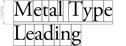
There is Line Height, which is used in CSS and is also a same thing as leading and line spacing. I prefer to use leading when I design for the print to avoid the confusion between line spacing and line height.
In this demonstration I decided to use 10pt font size and 12pt leading.
5. Module Height
Having chosen the font size and line height, it is time to start design the module and column of grid.
With font size and line height are given, only thing you should consider to draw grid is how many lines you want to put into a single module. The height of module is given like this:

If number of lines is 10, the height of module would be…
10*12pt-(12pt-10pt)=118pt.
If number of lines is 11, the height of module would be…
11*12pt-(12pt-10pt)=130pt.
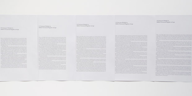
After I created several test prints setting 10-14 lines of module, I decided to go for 12 lines per module.
Note that the width of module is ignored here.
After choosing the number of lines per module, the height of grid—or column—will be automatically given:

In this case, the height of grid will be…
142pt*4+{12pt+(12pt-10pt)}*(4-1)=610pt.
6. Module Width & Gutter
The module width of grid is more flexible than the height of it. You can set any width as long as it fits in paper. It is, however, better to have it had meaning.
For example, you can set module width so that the proportion of end grid will follow the golden ratio—1:1.618. Or, another approach is to set the module width so that the proportion of module will be equivalent to the proportion of photography like 3:2 or 4:3.
This time I decided to adapt the latter approach and to make a module 2:3 proportion. Therefore, my module width will be 142pt/2*3=213pt.
The gutter, the space between columns, must be wide enough to recognize the difference of column, narrow enough not break the balance. I simply decide to set 12pt(1 pica) for the gutter width.
So the end of grid width will be…
213pt+12pt+213pt=438pt.
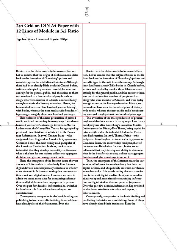
Now I got the all values required to draw a grid, and the grid would look like this.
In the figure above, margins are not concerned and the grid is positioned at the very center of paper. Also, the dummy texts being used are copied from http://www.honzukuri.org/en/ for which I wrote and developed in October 2017.
7. Adjustment
Let’s take a closer look at the vertical space between modules.
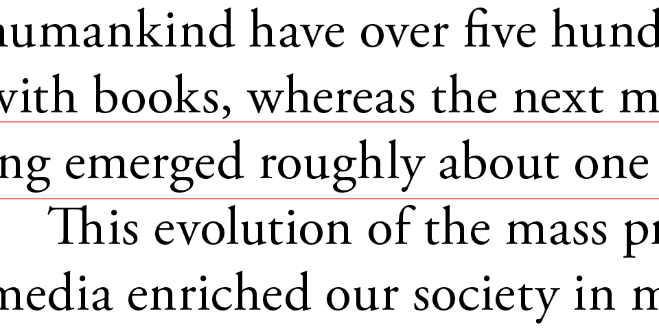
You see that the line of text between modules is not positioned at the very middle, but slightly to the bottom. If you are only laying out the text, this will not be much problem, but it will be if you need to insert pictures and captions of those. For this reason, I am going to make an adjustment to the grid lines.
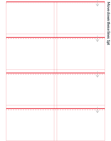
Having done this adjustment, the line of text between module is positioned at the middle. I will also make an adjustment to the module width accordingly since I want module to be 2:3 ratio. Finally, each length of module and grid will be as follows:
- Module Height: 141pt (49.742mm)
- Module Width: 211.5pt (74.613mm)
- Gutter Height: 15pt (5.291mm)
- Gutter Width: 12pt (4.233mm)
- Grid Height: 609pt (214.842mm)
- Grid Width: 435pt (153.458mm)
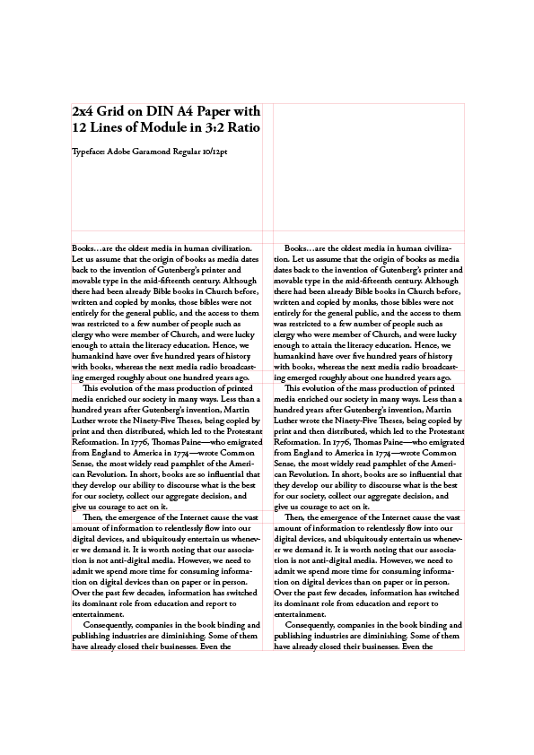
8. Margin
“It’s not what you put in but what you leave out that matters” says Paul Johnson. This time I set the horizontal margin so that the proportion of left margin and right one will be 1:2. For the vertical margin, I move the grid upwards until the center of grid meets the diagonal line of paper, which gives me roughly 78pt(27.517mm) of top margin. The final result of grid and design would look like this:
Please check out the PDF version.
Conclusion
About a year ago, I bought a legendary book on grid design Grid Systems by Josef Müller-Brockmann. Inside of book shows us practical examples of grid design with measurement—specifically p73, 77, and 88—and I wonder how he gets those numbers. This question leads me to inquire the relation of font size and baseline to the grid and eventually decide to write on this inquiry.
The system like grid design is, as rational and restricting as it is, sometimes seen as dull and boring, and disgraced by intuitive free-thinking designers.
I believe, however, that in a world in which every man and woman can express their thought and feelings, make a document that contains vast of information that one company possesses using Microsoft Word or Powerpoint, we as a designer must deeply inhale the air of graphical principles that our predecessors have established in twenty century, examining it with our modern lung, and exhale to this rapid changing world, just slowly and slowly.
I hope the readers find this article helpful in some way.
Resources
- Grid Systems in Graphic Design by Josef Müller-Brockmann
- Letter Fountain by Joep Pohlen
- Thinking with Type by Ellen Lupton