Design Button
Entry to the design system.
The UI designer Zac was still awake that evening. Technically, it was two o’clock in the morning. He was doing all of the work he had to finish by 9 a.m., before the developers got to work. Zac could make an excuse of course. But his pride prevented him from doing so. He wanted to be a good designer who brings the design on time. He wanted to be a good designer by any means after all. Who wouldn’t?
After twenty minutes passed six, instead of designing Zac was writing, an email to the developers. “Here is a final comp of design in XD file,” says the email. It was bright outside. He had pressed the send button with confidence. He had a good day sleep.
I guess many designers have had similar experiences like Zac, pressured by the deadline, struggling to make the best choice among number of design options. This is how usually design work proceeds.
The problem is what Zac thought good design is far away from it. His design was mediocre at best.
In Zac’s XD file there was no notes for the developers how the design should be implemented. Neither an artboard on instructions about components and modularization. He didn’t even dare to have a meeting with the developers, a chance to explain why he designed it, how he wanted it to be coded, what could be an issue to achieve his design. His gut tells himself “XD speaks everything,” fonts to size to colors. Everything.
As a developer who also designs, I have a sort of inclination how design should be composed and how it must be passed to developers. I’ve never tried making this inclination real before. But I am doing now. I wanted to start small. So I decided to start with button.
Button is a type of component which triggers a specific event upon pressed—physically or digitally.
Since the goal of all web/smartphone apps is to make users act on something, like purchase, sign-up, contact, any app has one button or more. It is ubiquitous. That is why button can be a good place to start, and be a good example for other designers.
Types
There are basically two types of buttons: enclosed or non-enclosed. Personally I’d like to call the latter “plain” button. Some might call non-enclosed button as “text” button.
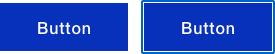
Enclosed
Enclosed buttons have boundaries. Their dominant area is very clear. It also somehow resembles physical buttons.
Enclosed button can also be categolized into two types: filled or outlined.
Plain
Plain buttons have no clear boundary. In term of box modeling, they have a boundary. But that is not visibly implied.

Plain buttons are just texts. They are less obvious than enclosed buttons whether you can click them. Plain buttons should be carefully placed in the context. They are generally used when the action triggered is not preferable or important.
Deriving from the early days of hyperlinks in HTML, to indicate the text is clickable, sometimes plain buttons are decorated with underline.

Yet in modern applications in which <a> and <button> co-exists, the use of underline must be restricted only to hyperlinks.
States
Here, the term “states” are used same as CSS pseudo-class such as :hover. To design buttons, one designer must consider five states of button:
- Normal
- Hover
- Active
- Focus
- Disabled
Normal
The normal states is a state in which the user is not interacting with the button. It is a default state.
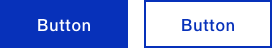
Hover
The button goes to hover state when the user points cursor(mouse pointer) over it.

In the figure above, the background color of button becomes lighter in hover state. This is one example. You can make filled button outlined, change text color, add drop shadow, and so on.
In general, when the button is filled, the background color turns lighter in hover state than normal state.
Active
The button goes to active state while the user is clicking the button—time between the user click the mouse, then release.
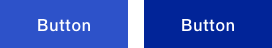
In general, when the button is filled, the background color turns darker in active state than hover state, even than normal.
Focus
The button goes to focus state after clicked, until the user interacts on the other element. It is not common to showing focus state of button to users. Usually focus state is for form elements such as input and select.
Some browsers have button had the visible focus state. I prefer overwriting its CSS to the normal state.
Focus state is different from the “active” or “current” state that indicates the element is acted on the intended event. The example is the tab panel controller. The active and current states are more component specific. These states are ignored in this post.
Disabled
Buttons can be disabled when the users does not fulfill requirements to click, to fire the certain event.
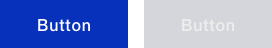
In general, when the button is filled, the button turns monochromic and/or pale in disabled state.
Sizes
Should button come in all sizes? My answer is no. Buttons don’t have to come in all sizes. It needs just a few. Besides navigational link, I believe in many cases two sizes of button are enough. If that’s not enough, it is acceptable to add one more size.
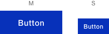
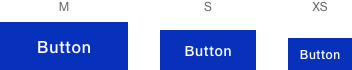
Above, I avoid to use the sizes of L, M, and S. It depends on the end sizes of three, but make the first choice of size M.
You can change the size of button for different media widths. I don’t mean you use the small size of button for smartphones, the medium size of button for laptops. I mean you design the two medium size of button for smartphone and laptop, make buttons fit in the device. This is a cumbersome process, yet brings more competency. Sometimes whether you can take this process depends on the schedule, budget and agreement among the team.
Colors
Tailwind has twenty two hues in its color palette. That is a vast amount of choices. It meets the much design/css demands with flexibility and efficiency in the real application development.
Nonetheless, less choices will make designer or developer eased deciding which color to be used.
For buttons, four main colors are sufficient. Those colors are:
- Brand color, for primary use
- Green, for preferable action
- Red, for cautious action
- Gray, for alternative action
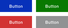
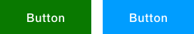
Sometimes, the preferable color is substituted with cyan-blue.
If one brand color is one of those colors, designer must take more careful planning.
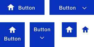
Icons
Nowadays, icons are uses as a part of button. The label text can have the leading or following icon, whether horizontally or vertically.
The icon can be a button itself. You have choice to enclose the icon or do not enclose.
How to design icons itself is a different topic. So it omitted here.
Styles
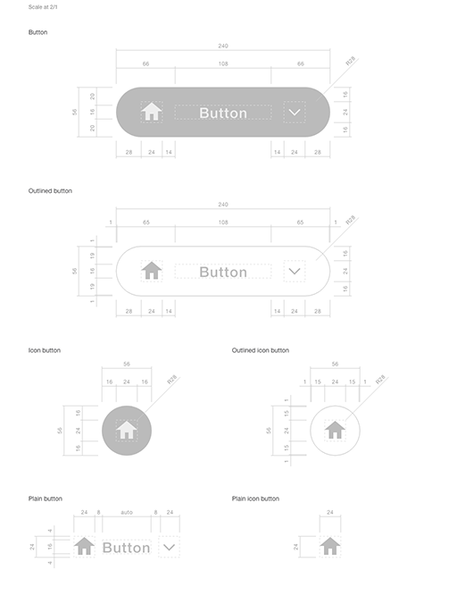
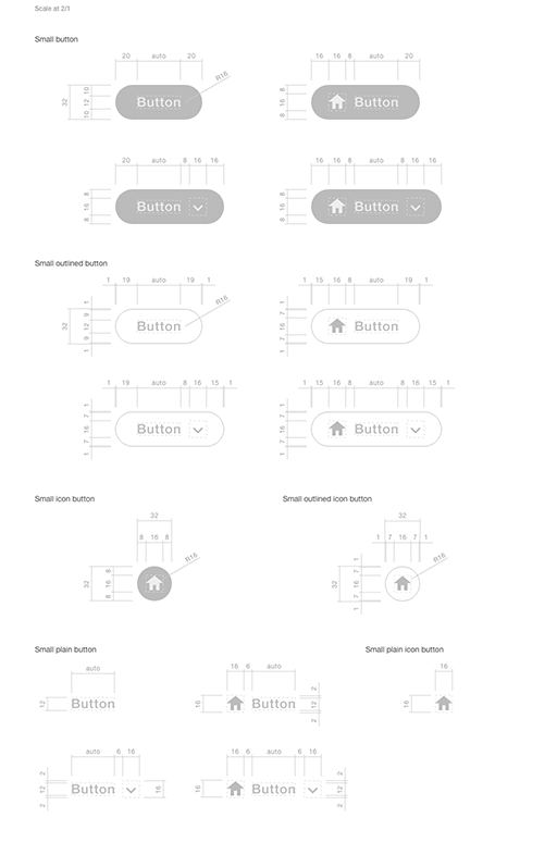
Border Radius
You can round the corner of button.

Box Shadow
Or add shadow to make it more realistic.
Space
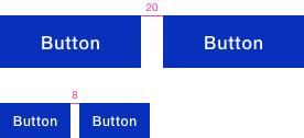
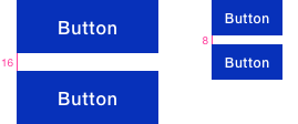
Keep the space of buttons consistent and specific. Plan these spaces before make the comp design. Your comp design will be more comprehensive.
Group
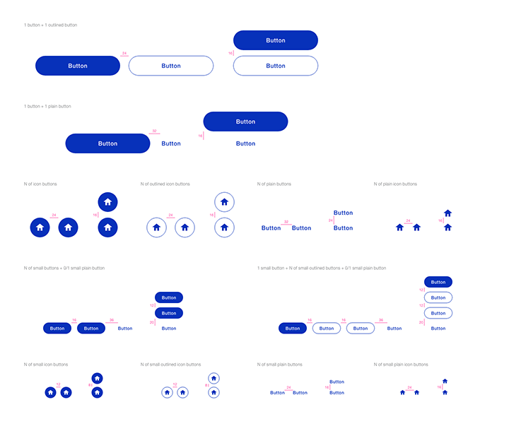
By creating a comp design, you would encounter the occasion that the sequential same type of buttons does not do what they are supposed to do: distinction. In which case, you need the combo. The more variants of button you design, the more possible combinations would be. That’s a terrible practice. Some combinations relieve our minds.
Put all together
The good design specifies all variables listed above.
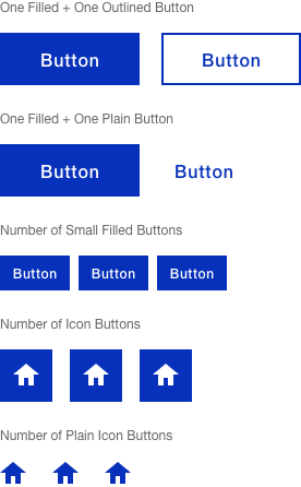
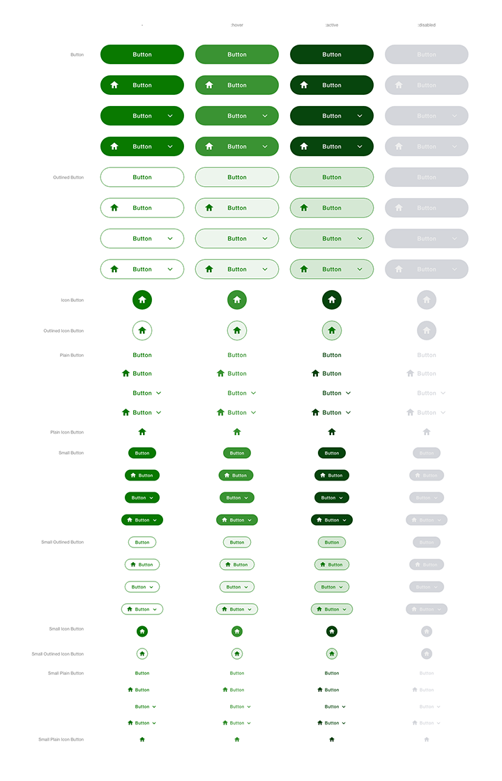
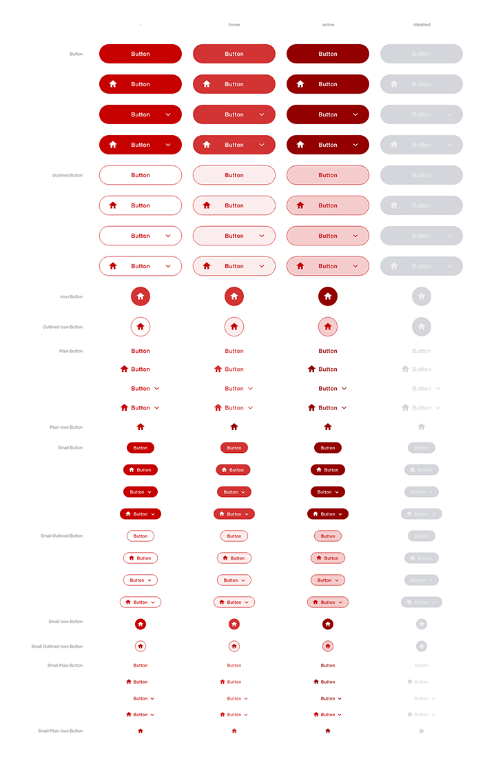
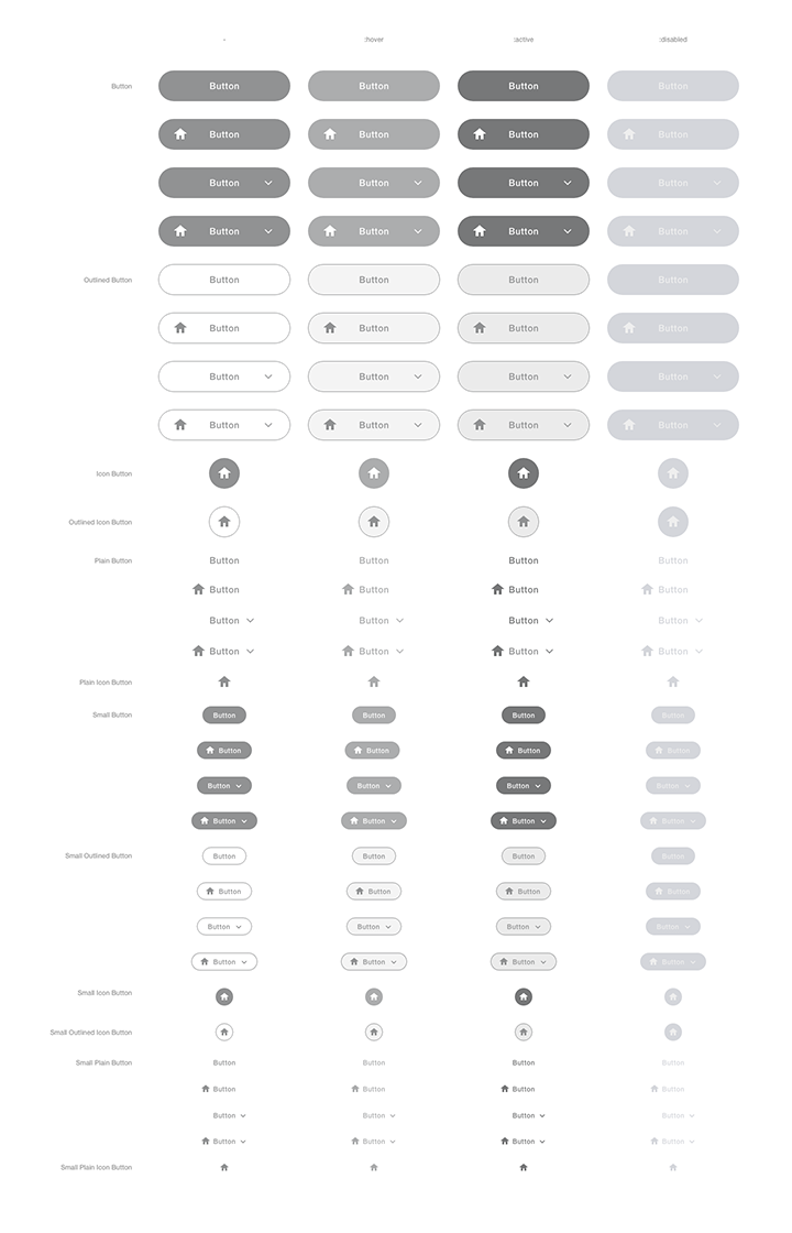
Let the button have six types:
- (Filled) button
- Outlined button
- (Filled ) icon button
- Outlined icon button
- Plain button
- Plain icon button
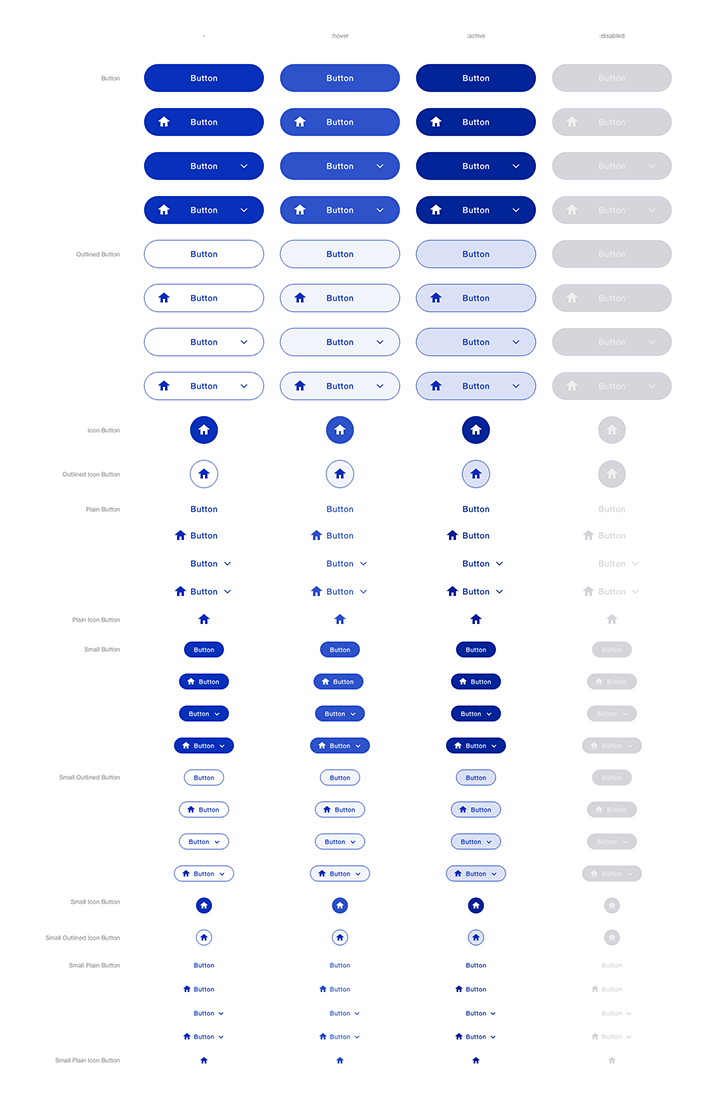
Each of which has four states:
- Normal
- Hover
- Active
- Disabled
In two sizes:
- Medium
- Small
That comes with four color themes:
- Primary (blue)
- Green
- Red
- Gray
Plus, Filled, outlined, and plain plain buttons can have:
- No icon
- leading icon
- following icon
- leading and following icon
Which gives me the total variants of:
3-type * 4-state * 2-size * 4-color * 4-icon option + 3-type * 4-state * 2-size * 4-color
= 384 + 96
= 480
No kidding. You have to design 480 variants! So here is how it comes.
You can see the following images at xd.adobe.com.
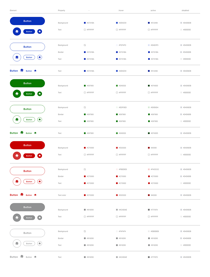
Hex Color Codes
By creating the table of color codes, developers don’t have to pick up the colors by selecting each color of button, each state. The list also makes them code color variants easier.
Group & Space
Don’t forget to specify what combination of button types is allowed, how each button is to be spaced. No more rectangles to measure the space.
Blueprint
Having a degree in engineering, I have tendency to put design into blueprint.
The goal of making these design is not the perfection, but consistence. Consistence throughout the project, among the team both designers and developers.